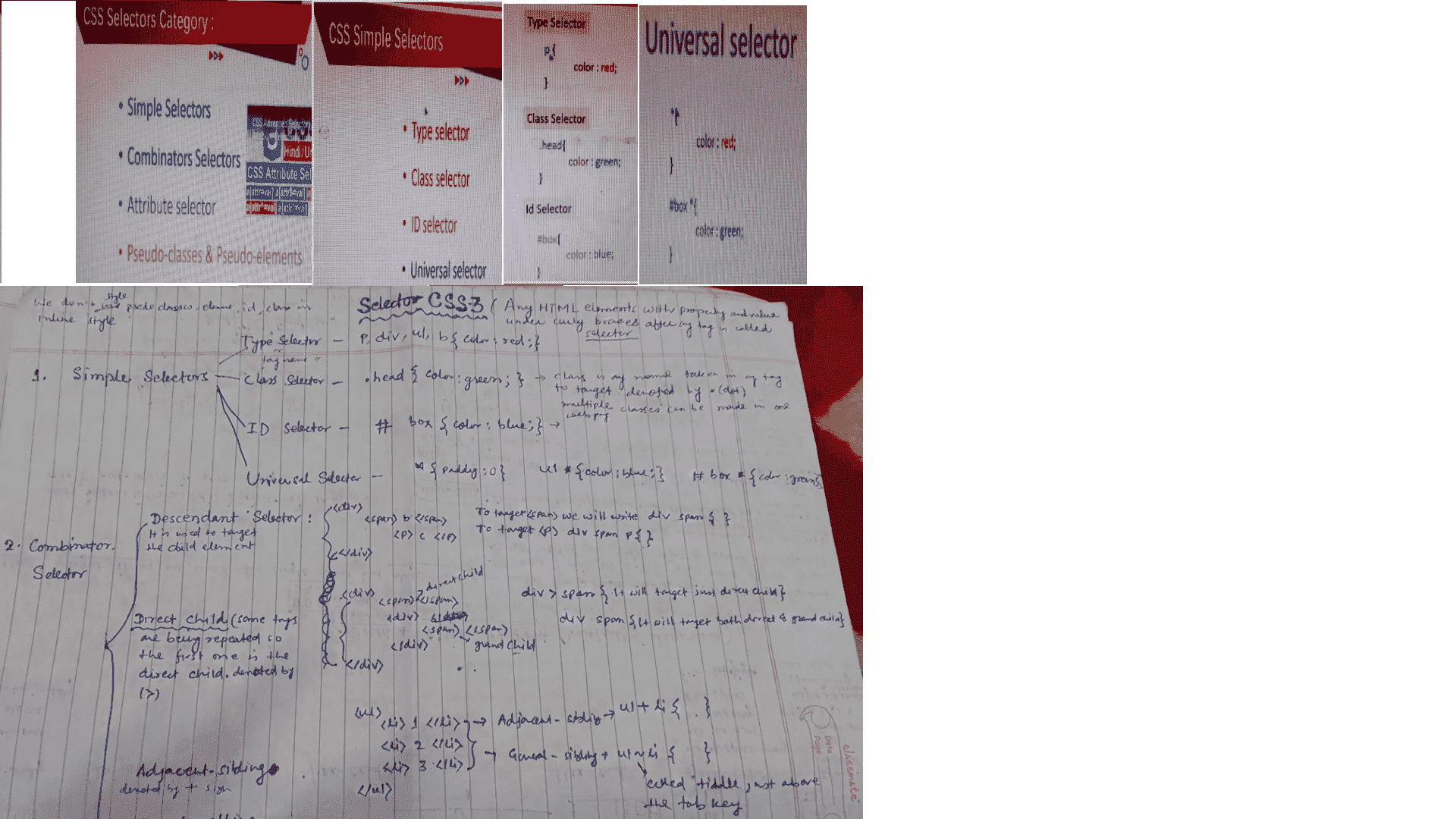
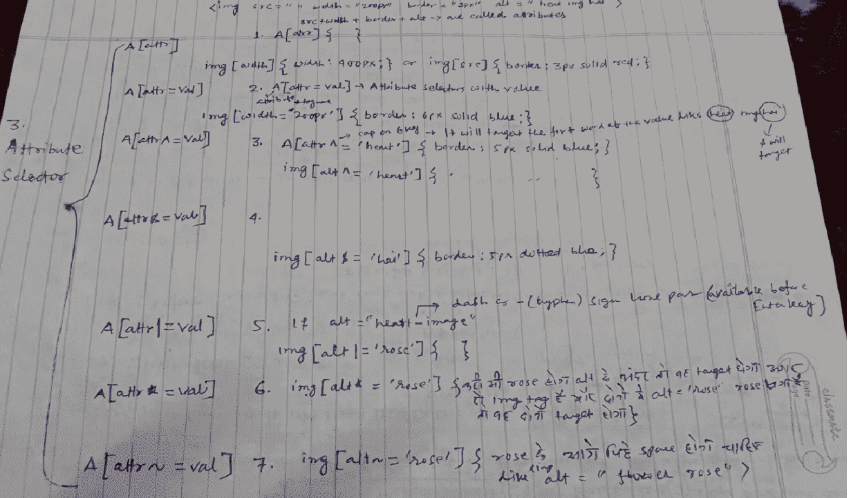
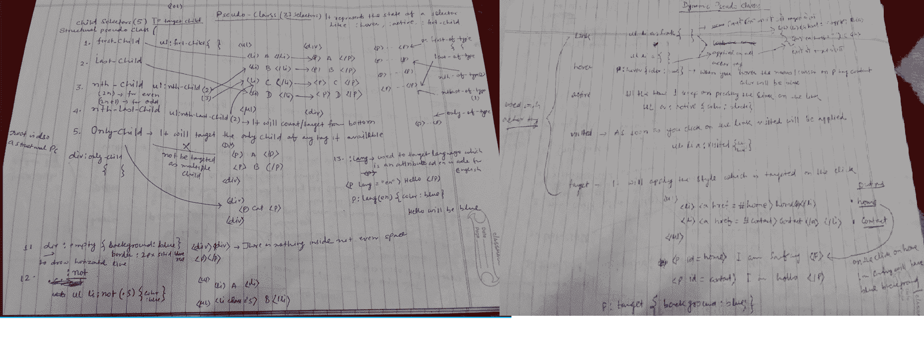
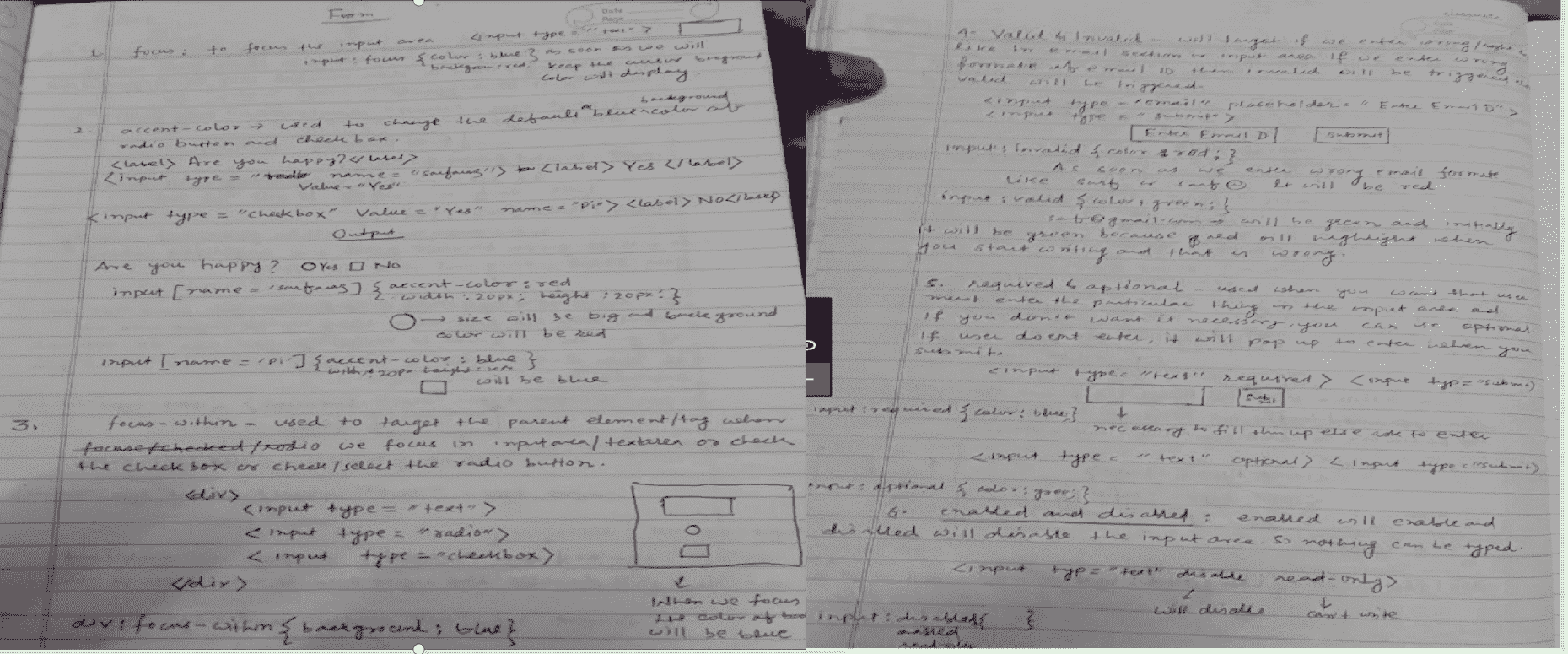
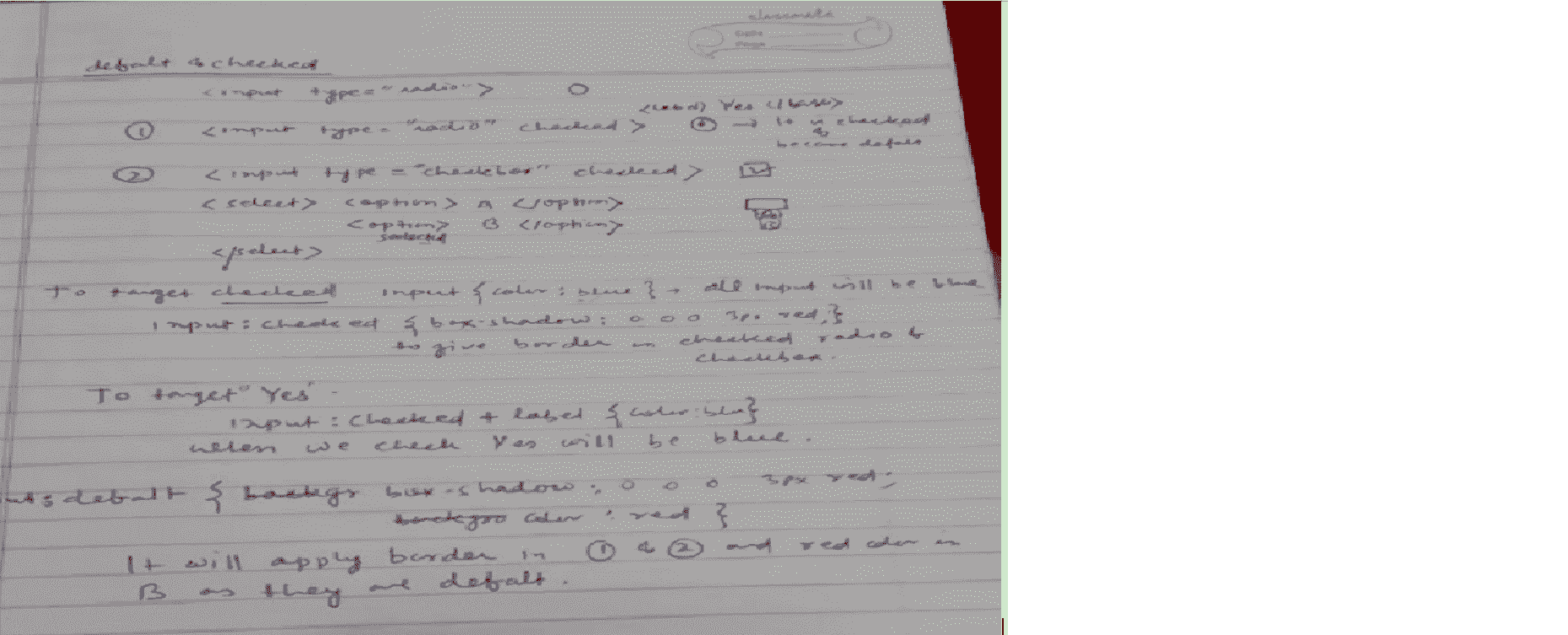
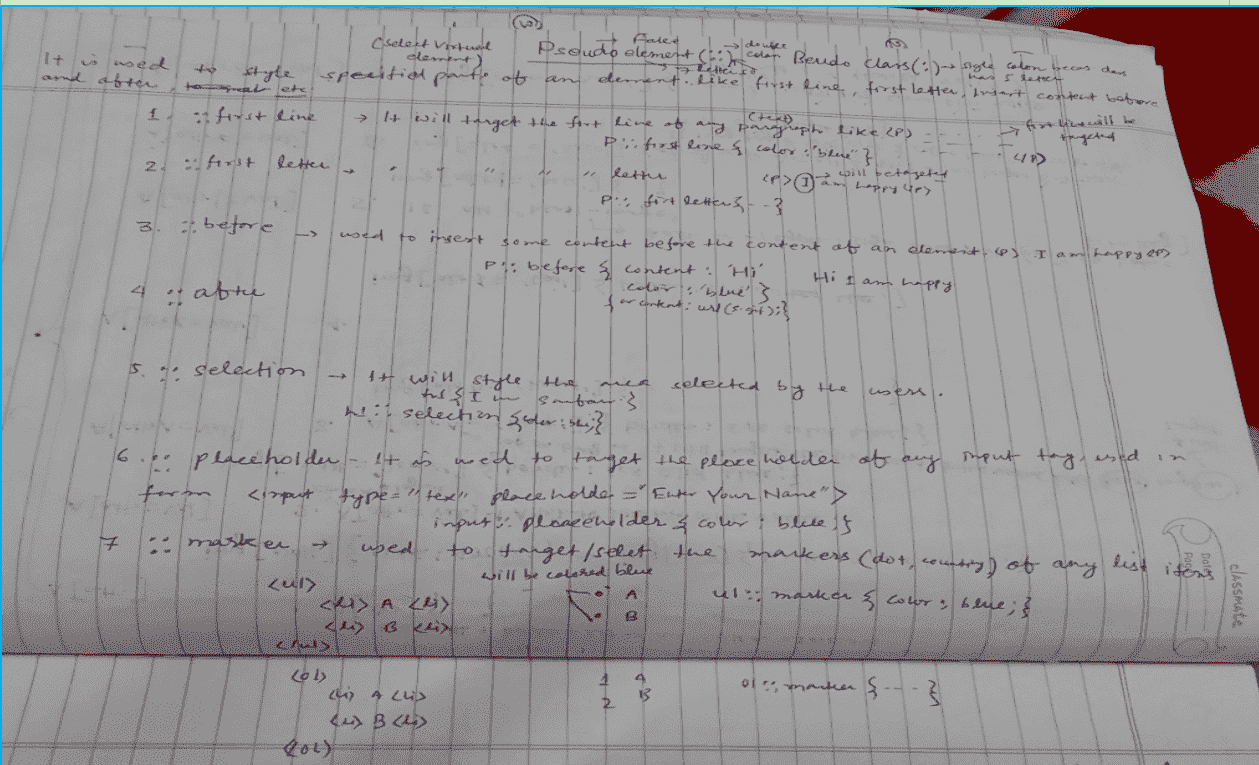
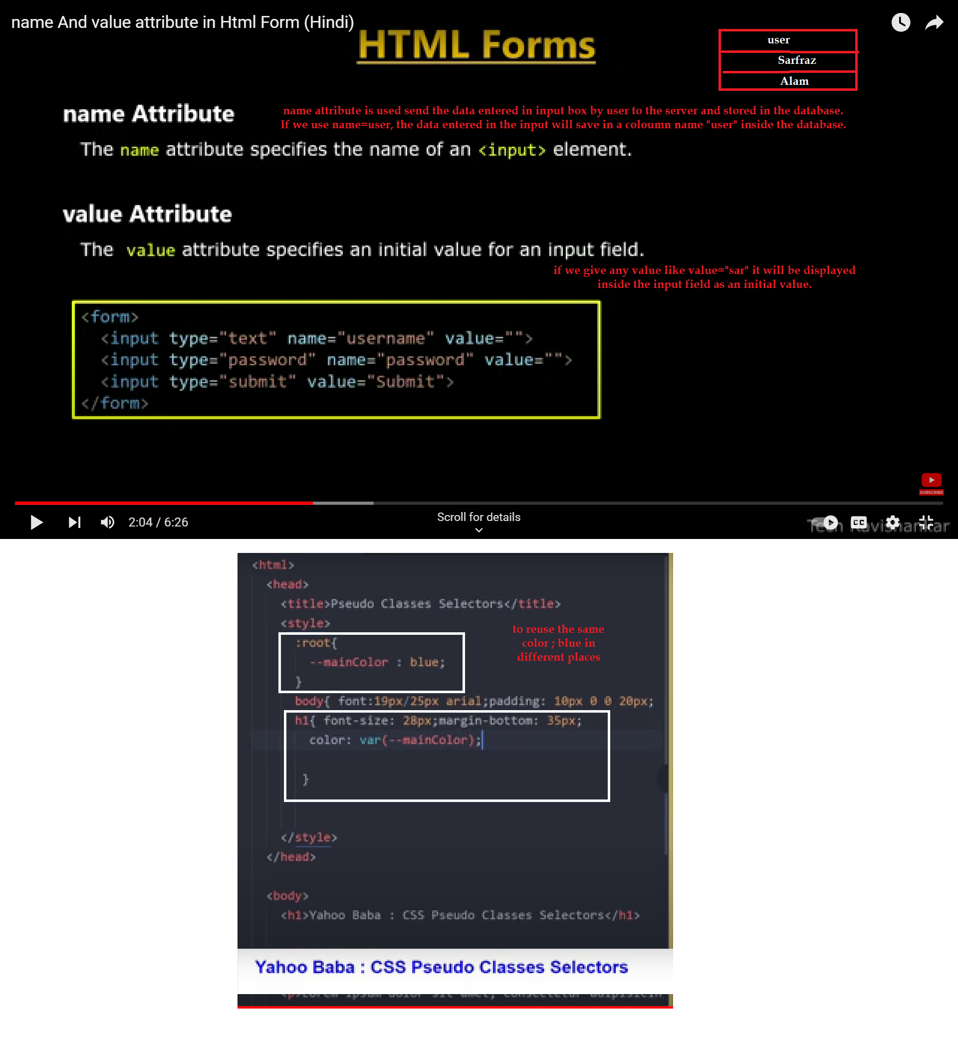
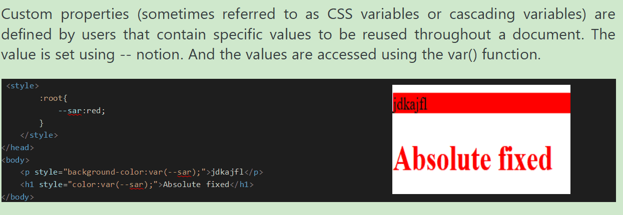
What is name and value attribute in the form and css variable/root pseudo-class?
Way to convert voice/speech to text online
Way to know font style from image

- Website Helper 5(All languages with project)
- How to add different style sheets for different browsers
- template with source code
- Website Helper (header, footer, slider etc.)
- Website Helper 6(to remove the background)
- All CSS SOLUTION
- Website Helper 6(to remove the background)
- Website Helper 4 (small project)
- Website to create slider
- yahoobaba
- to create website template
- gif image background changing
- lazy loading image notes link
- gif image croping
- How to use create slider
- Website to create website template and others
- How to make the image transparant
- website to apply Accessibility
- AI website to solve issues, write issues, code generate, picture, video, music, ppt generate
How to save 1000 numbers in mobile contacts easily.
- Save the file with name and contact heading and then save with csv extenstion
- Go to desktop gmail secton and click on 8 dots and then go to contacts
- Import .csv file and click on import and wait for sometime.
- It will add all contacts with number and go to the phone and make sure you are logged in to your mobile contacts with the same gmail account you used on desktop.
- Youtube Link
- Use a Content Delivery Network (CDN):-
- Use better host for the website:-
- Optimize the size of images on your website:-
- Reduce the number of plugins:-
- Minimize the number of JavaScript and CSS files:-
- Use website caching (kashing):-
- Implement Gzip Compression:-
- Reduce the use of web fonts:-
- Detect 404 errors:-
- Reduce redirects:-
- Database optimization in CMS:-
We know that, the load time increases when users are physically far from the server. With CDN, user requests are redirected to the nearest server. As a result, the content is delivered to a user quicker and a website works faster. This is a rather expensive, but quite effective way to optimize the load time.
Sharing hosting. That’s the cheapest way to get your site online in a short time and for a low fee but shared hosting isn’t as fast as VPS or a dedicated server because in sharing hosting CPU, disk space, and RAM are shared with other sites that also use the same server. Virtual Private Servers and dedicated servers are much faster. VPS uses multiple servers for content distribution. VPS will be the optimal solution for you If your website has the average traffic or I have eCommerce site with traffic spikes in some periods, The most expensive hosting option is to use a dedicated server which can be your own physical server. In this case, you pay a server rent and hire a system administrator to maintain it.
Whenever we make any website, we may use lots images specially in commerce website that takes to much data and slower the web-page. The best way to reduce the image size without compromising its quality is to compress images using tools such as ImageOptim, JPEGmini, or Kraken. The procedure may take a bit of time but it’s worth it. Another way to reduce the image size is to use the HTML responsive images and attributes that adjust image size based on user display properties.
We use different plugins to add specific features suggested by third parties. Unfortunately, the more plugins are installed, the more resources are needed to run them. As a result, the website works slower and also security issues can appear. Before using the plugins, we should first run the performance tests on the web-page to find out which plugins are slowing down the website and then try to avoid plugins that load a lot of scripts and styles or generate a lot of database queries. The best solution is to keep only the necessary ones and ensure that they are kept up to date.
If any website contains a lot of JavaScript and CSS files, it leads to a large number of HTTP requests when the website visitors want to access particular files. These requests are treated individually by visitor’s browser and slow down the website work. If we reduce the number of JavaScript and CSS files, it will load the website quickly. We can also try to keep all JavaScript into one and also do so with all CSS files. This will reduce the overall number of HTTP requests. There are a lot of tools such as WillPeavy, Script Minifier, or Grunt to minify HTML, CSS, and JavaScript files quickly.
We know that when my website is accessed by a lot of users at one time, servers work slowly and need more time to deliver the web page to each user. Caching is the process of storing the current version of the website on the hosting and presenting this version until the website is updated. This means that the web page doesn’t render over and over again for each user. Cached web page doesn’t need to send database requests each time. If the website is developed on WordPress then we can use plugins like: W3 Total Cache or W3 Super Cache.
Gzip Compression is an effective way to reduce the size of files. It minimizes the HTTP requests and reduces the server response time. Gzip compresses the files before sending them to the browser. On the user side, a browser unzips the files and presents the contents. This method can work with all files on your website. We can enable Gzip on your website by adding some lines of the code or via a utility called gzip.
Web fonts have become very popular in website design. Unfortunately, the use of web fonts has a negative impact on the speed of page rendering. Web fonts add extra HTTP requests to external resources. The following measures will help you reduce the size of web font traffic: Use modern formats WOFF2 for modern browsers; Include only those character sets that are used on the site; Choose only the needed styles
A 404 error means that a “Page isn’t found”. This message is provided by the hosting to browsers or search engines when the accessed content of a page no longer exists. In order to detect and correct a 404 error, you can use error detection tools and plugins. Xenu’s Link Sleuth, Google Webmaster Tools (GWT)
Website redirects create additional HTTP requests which negatively impact performance. We can use Screaming Frog to quickly identify redirects.
Database optimization is the an effective way to increase performance. If we use a content management system (CMS) packed with complex plugins, the database size increases and the website works slower. For instance, the WordPress CMS stores comments, blog posts, and other information that take up a lot of data storage. Each CMS requires its own optimization measures and also has a number of specific plugins. For WordPress, for example, you may consider WP-Optimize.
vs code shorthand/shortcut
.png)
.png)
.png)
.png)
How to create subdomain and upload website in it
Object Fit
Here are the steps to add google map to your website.
visit https://www.google.com/
Search for you location on the search bar on the left hand side
Click on the three hamburger or toggle menu button and go to the share or embed map
Copy HTML of embed a map and put it inside the div where you want to add
Set width 100% and height in the copied link and also set the same height in the div or auto
Inline Elements: Inline elements don't start on a new line, they appear on the same line as the content and tags beside them. Inline elements are text tags or text properties like, and tags. These are inline elements are bold, heading, italic, anchor, span , strong, img and align horizontally and width, margin, padding will not work properly so to use margin, padding, width and height we need to make them block by using display: inline-block; it will become block in one line. To show these in different lines we need to use span{display:block}. Now, span will work like block element. We use display: inline; to align all the block element in one line p{display:block;} Inline Block Elements: Inline-block elements are similar to inline elements. Inline elements will become inline block elements when we add padding and margins, height and width values to them.
How to add whatsapp chat icon to your website?
-
First we will add fontawesome cdn path for whatsapp logo to display on the screen
<link href="https://cdnjs.cloudflare.com/ajax/libs/font-awesome/5.10.0/css/all.min.css" rel="stylesheet"> - Second we will align the icon wherever we want and appy position:fixed, left:0; bottom:0; z-index:999;
- Now, google, whatsapp click to chat and open this link.
- You will get a link like Use: https://wa.me/918757960960
- Now, write as shown below to open the whatsapp chat
<a href="https://wa.me/918757960960" target="_blank"><i class="fab fa-whatsapp-square back-to-top"></i></a>
How to record screen audio and video
We can use shareX as it is free and follow the steps for better voice quality.
To record the laptop's internal sound, go to Task Seeting >> screen recorder >>
screen recorder option >> The Audio source should be a microphone to record
from the microphone for better quality and make sure
device sound/laptop sound is 100%. So, it is better to use a microphone with 100%
volume for better sound quality and also there should not be any background
noise.
Virtual audio capture to record device audio.
Select connected Airpod/headphone name if connected will not give a good voice.
- ::after
- ::before
- ::placeholder
- ::first-line
- ::first-letter
- ::marker
- ::selection
- :link
- :visited
- :hover
- :active
- :focus It is a part of form.
How to extract data/take out/remove data/phone number from justdail and store in a file
- Go to justdail.com
- Choose the palce and type of data you want like school or any other.
- Searc for Goyral JD Extractor in google and it as an extension to chrome.
- Create an account and enter the url link and then click on collect data.
- Click on show data after some time.
- Youtube Link for more info
Job posting sites link
How to send bulk sms free
- Need to install prosender extension in whatsapp and then it will open whatsapp web that we need to login using phone.
- Add +91 before all mobile number and to do it use ="+91+(fied of mobile number) and then hit enter
- Once open the whatsapp web on chrome browser, click on the PS extension
- Now, add all the number under the box
- Now, Type text you want to send in the blow box
- To add image, click on Add Attachment
- To give time gap to avoid blocking the number use 20 second of time gap
- Click on Add baching, and then add 5 messages in one batch and add 30 seconds time gap
CSS stands for Cascading Style Sheet. It’s a style sheet language that determines how the elements/contents in the page are looked/shown. CSS is used to develop a consistent look and feel for all the pages. The latest version of CSS is CSS3.
CSS was developed and is maintained by the World Wide Web Consortium(kansawtium) (W3C). It was first released on December 17, 1996. CSS framework.
CSS is a library and its framworks are Bootstrap, Bulma, Skelton(isskeltn), Foundation.
A style sheet is a file on which codes like padding, margin, page size are written in form of code and that help to make the layout beautiful. 2.Use of Rule-set It is used for the identification of the selectors. There are two types of ruleset Selector used to style the HTML element Declaration Block: it contain one or more semicolons
How to call customer if receive any inquiry
Greeting: "Hello [Customer's Name], this is [Your Name] from [Your Company]. Am I speaking with
[Customer's Name]?"
Confirmation: "Great, I'm calling in response to your inquiry about our [service]."
Brief Introduction: "I'd like to provide you with some more information and answer any questions you might have."
Description of Service: "Our [service/product] offers coaching classes from 1 to x for different boards
such as (JAC) Jharkhand Academic Council, (CBSE)
Central Board of Secondary Education, and (CISCE) Council for the Indian School Certificate
Examinations.
We do offer Admission in Engineering, Pharmacy, Nursing, IT, and
Para-medical with placement assistance
and We are also providing coding classes with guaranteed job
placement.
Open-ended Question: "Could you tell me a bit more about what you're looking for in [999moneysave.com]? This will help me tailor the information to your needs."
Address Concerns: "If you have any specific concerns or questions, please feel free to ask. I'm here to help clarify anything for you."
Next Steps: "Based on what we've discussed, are you interested in moving forward with coaching assistance for your child who is in class ?"
Am I correct?Could you please confirm your email address/phone number so I can send you additional details?"
Arrange Follow-Up: "When would be a good time for you to discuss this further?"
"Thank you for considering 999moneysave.com . I look forward to assisting you further."
"Have a great day, [Customer's Name]."
CSS is old version CSS3 is the latest version
CSS3 supports module, media query, all the new browsers but CSS does not.
CSS3 supports gradient, RGBA, HSLA, HSL but CSS support old standard of color. CSS3 is mobile friendly but CSS is not.
Latest property of CSS3 animation, border-box, background & its properties like background-position, background-repeat, and background-image, test-shadow,box shadow(We have box shadow generator border-radius, flexbox, transform, transition.
background transparant
Use the website to make the background transparantCalss is a way of styling the HTML element. It is not unique but id is unique. Id can be assigned to a single element but class can assigned to multiple elements.
What is common between class and ID?
Both class and ID are used in HTML to assign a value from CSS. The ID is used as an element, whereas the class is used as a block.
How to reduce the video size
The four types of media properties are print, speech, and screen and all. Example of using print-media type: Media query means writing css for different media like print, screen and speech and all, all means all the three medias.
Print means how the print out should be if print is taken out or writing css for print.
Screen means how should be the web when it is shown in mobile screen,tablet screen like ipad, monitor screen, laptop screen or app screen. So, writing css for different size of screens is called media screen. Speech that reads the content for the blind.
viewport is the size of the screen and it can be different for different screen. Commonly used view-ports are 320px, 480px, 760px, 960px, 1200px, 1600px etc. 900 -1680 for laptops 700 to 900 for tabs in px, 320 to 540 px for mobile
@media screen and (max-width:900px){ .container{ width:50%} } The CSS that you write will be applicable till the screen viewport or width is between 0 to 900px. 900px is called break-point and it can be different for different screen. Here, .container{ width:50%} means if the screen width is between 0 to 900px then container class width will be 50%. We can write different conditions as well instead of max-with like min-width, min-height etc as shown below. If we want to give two conditions like max-width:200px and min-width:100px then we can use logical operators like “and, not, only” . Please note that we need to use meta viewport under head tag and set internal CSS (like under head not internal) and media query should be written after internal CSS or at the end of the CSS files under head tag then only media query will work properly. To use two conditions, we will write like @media screen and (max-width:800px) and (orientation:landscape) and (min-width:200px){}
How to move any text on scrolling.
As per WWW(w3c) every HTML element is a box and each element or box has its own properties. Box model is used to understand these properties. In another word, a box model is a combination of content, padding, margin and border. It is used to determine the height and width of the rectangular box. When we give height and width, it is applied to the content.
The CSS Box consists of Width and height of the content, padding, borders & margin
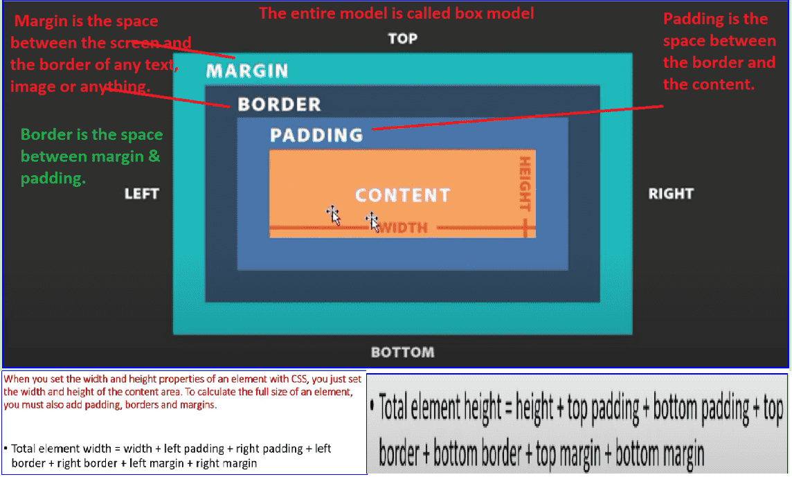
The border-box and content-box are two values of box-sizing. The box-sizing tells how the width and height of an element are calculated. In another word, we can say that it will tell whether padding and border should include or not. We have two properties of border-box. box-sizing:border-box; width will not increase. On the contrary, the actual width will be 200(width/content-width) - padding(from right and left) - border(from right and left) If width is 200px and padding is 10px from right and 10px from left and border is 5px from left and 5 px from right. So, actual width will be 200 - 20 - 10 = 170px
box-sizing:content-box; It is a default property and width will increase. The size of the width will increase if we take 10px border from left & right and 10px padding from left & right and the total width will be 240px . The margin is not calculated in box-sizing:border-box;
The main advantages of CSS are given below:
Styling the HTML tags
Responsive website We can make our website Responsive which means its width & height will adjust automatically according to the screen size with the help of media query launched in css3. Responsive website helps to change the design according to the screen.
Animation on web page You can make Animation with the help of css3.
2D and 3D transformation of HTML elements Like you can rotate the heading in 90 degrees launched in CSS3.
website development process fast You can target multiple HTML pages with one CSS file.
Disadvantages of CSS are given below: Browser Compatibility: Some style selectors are supported and some are not. We have to determine which style is supported or not using the @support selector).
Cross Browser issue: Some selectors behave differently in a different browser).
There is no parent selector: Currently, Using CSS, you can’t select a parent tag.
How to add https or make the the website secure.
Step 1 :- log-in to hostinger and go to the security section and under it go to the SSL and check if it expired if expired, reinstall it from there.
Step 2:- Use redirects under domain if the above one does not work.
1. Inline Style Inside the HTML tage with style property.
Limitation of Inline style page is that pseudo class and elements can not be used in inline style.
2. Inpage Stype Page
It is applied within head3. External Style Sheet style.css is file name css extension.
Another way to add CSS is by using the @import rule. This is to add a new CSS file within CSS itself. Import rule is used to use one css file to another css file if you have two or more than two css files. Here, it is not required to make different links for different css file. We will define one link and import another css file into the defined css file or linked css file.
To use the another css file into a defined or linked css file we use @import "path/to/style.css"; // This is for relative path
We have second method as well @import url("https://www.sarfraz.com/style.css"); // This is for absolute path
Third way @import “printstyle.css’’ print; //Will apply css of printstyle.css when print is taken out.
How to delete history and all messages
To delete call history, go to call history by clicking on phone >> Click on three vertical dots >> select call history >> Click on three vertical dots again >> clear call history.To delete all messages in one go, go to play store and download an app "imessage" From this link and set as default.
Youtube link
It tells us about the ways to give height and width . There are two types of units.
Absolute Unit which is fixed like pixel, length, inch etc.
Relative Unit which changes according to the main/parent div like % and the width will be responsive depending on screen size or parent div/container size.
EM is a CSS unit relative to the font size of the parent element, while rem is a CSS unit relative to the font size of an HTML element. The rem unit means "The root element's font-size" (rem stands for "root em").
percentage is relative to the parent div but rem and em are relative to the browsers/viewport. em and rem(relative em) are used to give font size. 1em=parent font size. 2em=2 x parent font size 0.5=half of parent font size. 1em is usually equal to 16px and it will convert the font size into 16px if parent font size is not defined. rem is also like em but it is not dependant on the parent div on the contrary it depends on root tag size like HTML because it is a root tag so need to write html{font-size:10px;} under style then 1rem=10px or browsers font-size that can be checked from settings.
We use rem and em to make the font size responsive.
Viewport
Viewprot is the size of the screen.
It’s a CSS unit used to measure the height and width in percentage with respect to the viewport. It is
used
mainly in responsive design techniques. The measure VH is equal to 1/100 of the height of the viewport. If
the height of the browser is 1000px, 1vh is equal to 10px. Similarly, if the width is 1000px, then 1 vw is
equal to 10px.
vw(viewport width & vh(viewport height) work according to the viewport width and viewport height. if width:100vw and height:100vh; then the width and height will be according the screen viewport width and height. if width:50vw and height:50vh;then the width and height will be half or 50% of the screen viewport width and height if width:50vmax; then viewport mein jiska width jyada hoga(maximum) (screen ko chhota bada karne par) hoga usi ke 50% div ho jayega. if width:50vmax; then viewport mein jiska width jyada hoga(manimum) hoga usi ke 50% div ho jayega.
px is not cascade. em maintains relative size. you can have responsive fonts. Em, will cascade 1em is equal to the current font-size of the element or the browser default. If u sent font-size to 16px then 1em = 16px. The common practice is to set default body font-size to 62.5% (equal to 10px). pt(point) are traditionally used in print. 1pt = 1/72 inch and it is a fixed-size unit. %(percentage) sets font-size relative to the font size of the body. Hence, you have to set the font-size of the body to a reasonable size.
Refund Policies:- We have a 7-day return policy, which means you have 7 days to decide whether to continue
with the class or not. In case, you are not happy with the teaching technique, you may request a refund
with a valid reason. If the users have genuine reasons, we will refund the money to the source.
Please note that money will be non-refundable if you take the monthly plan by paying Rs 499/-. The refund
policy is applicable only if you take
Yearly, Half-Yearly, or Quarterly plan.
To initial a refund, you can contact us at onlineLearning@999moneysave.com
Privacy Policies: When you visit the website, we collect certain information about your device to process
the online teaching.
We collect information such as name, age, class, address, contact number, payment information, etc from
form when you submit the form
and cookies when you visit the site.
We do provide support via email.
Terms and Conditions (or Terms of Service):
Please read the Terms and Conditions carefully before accessing or using our website. By accessing or
using our website, you agree to be bound by these terms of service.
Disclaimer: All content and information on the I website are for informational and educational purposes
only, do not constitute educational/teaching advice, and do not establish any kind of educational
mentor-client relationship by your use of this website.
Copyright Notice: Materials used in connection with this course may be subject to copyright protection.
Materials may include but are not limited to documents, slides, images, audio, and video. Materials in
this course Web site are only for the use of students enrolled in this course, for purposes associated
with this course, and may not be retained for longer than the class term. Unauthorized retention,
duplication, distribution, or modification of copyrighted materials is strictly prohibited by law. For
more information, visit the UNT Policy Office or Copyright.gov.
Accessibility Policy: we are committed to ensuring that https://999moneysave.com/ is secure and accessible
to some extend.
How to file for GST
How to register for a Company?
First, we need to visit the websit
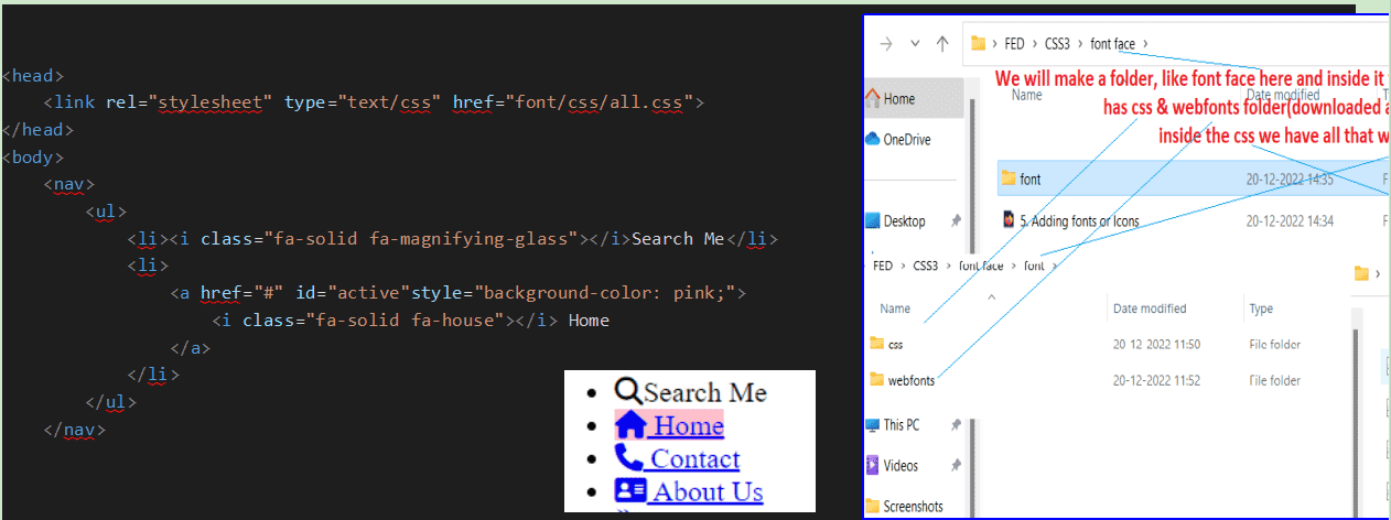
then right click on it to extract here and then click on css and then copy all.css written as all and
then paste it to your own folder under css and also paste the webfonts under css. We need to link the all.css as
To set the icon, visit the given link below and then click on icons and then seach the icon you want and click on it and then copy the link and paste where you want to add. The highlited icon is the free one that you can use.
We use font-family for changing the font face. Font-family means which font you want to apply or want to see an an output of text on your web-browser. like arial,verdana etc. font-family:arial; means it will set arial family on the text but it we write it as font-family:arial,Helvetica,verdana;
When you open the website, it will check your system if your system has Arial font if yes then Arial family will apply or else Helvetica will apply. If arial is not available but Helvetica is available if both are not available then verdana will apply if available or if all the three fonts are not available browser’s default font will apply. We can set font-family for body, header, footer, side-bar differently if we want.
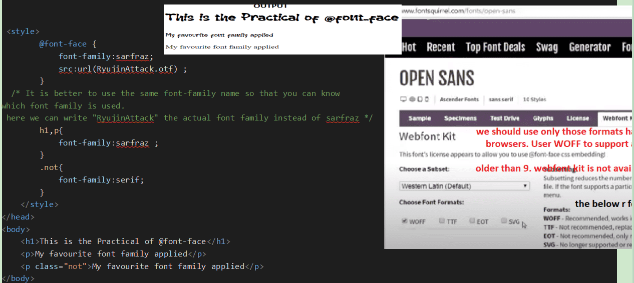
Use of @font-face rule
It is used to download and set any font size so that you can see the same font size as others can see. When you use this rule, it makes the web slow as request to server to display the same font. We can use to two website to download the font. download the font in which you can see the web-font kit as it supports all the format.
Use of google font

We can also use google font api using @import
Click on the link to use We will simply add the @import(path) in css fileFilter is used to change the color of any image or gives affect on the image but backdrop-filter affects the area of the image only, with the following values as given below. It was introduced in CSS3.
none.It is default value.
blur(0) It is used to blur the picture.Its default value is 0 if blur(0) it will appear as the image is if (2px) it will blur written as blur(4px)
brightness & contrast: Its default value is 100 if brightness(100) it will appear as the image is if (102) it will be brighter and less than 100 darker, 0 means black. Its value is given in % as well.
drop-shadow() It is just like shadow. 8px for left with plus value, 1px for bottom with plus vale, 0 is blue, color.
grayscale : It is used to make the image black and white. Its default value is 0 if grayscale(0) it will appear as the image and if (0 to 100) it will be getting balck and white.100% will be totally black and white.
hue-rotate : It is used to change the color between 0 to 360 degree. 360 is default
invert : It is used to change the color between 0 to 100%. 0 is default
opacity : It is used to make the image transparent.between 0 to 100% or 0 to 1. 100% or 1 is default which means opaque(no transparent at all). 0.5 means half transparent.
Position is used to position the HTML element. It is a property and it has five values (Absolute, Relative, Fixed, Sticky, and Static). The position property needs helper properties like left, right, top and bottom and they are necessary to use with position to make changes.
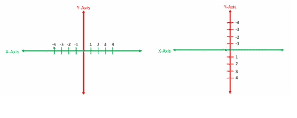
When we have to move any HTML element horizontally, we us left and right . Plus value will move rightwards and Minus value will move leftwards.
When we have to move any HTML element vertically, we us top and bottom . Plus value will move downwards and Minus value will move upwards as you can see in the image given below.
Absolute will move the HTML element from the screen you are working on but if we set position:relative in the parent div and position:absolute; in the child div then position:absolute will work according the parent div in which position:relative applied.
Relative will move from its own position.
Fixed will fix the image or anything and if you scroll the content, image will not move but in position: relative/absolute; image will move.
Sticky will also fix the image but after moving the till the value you set. like top:50px then it will move to 50px top and then it will fix.
Static is the default value which does not make any change.The only reason we would ever set an element to position: static is to forcefully remove some positioning that got applied to an element outside of your control.
Note:- If there are two divs and parent div has value position:relative then child div will move according to parent div if position:absolute; applied in child div because absolute of child div will be parent div.
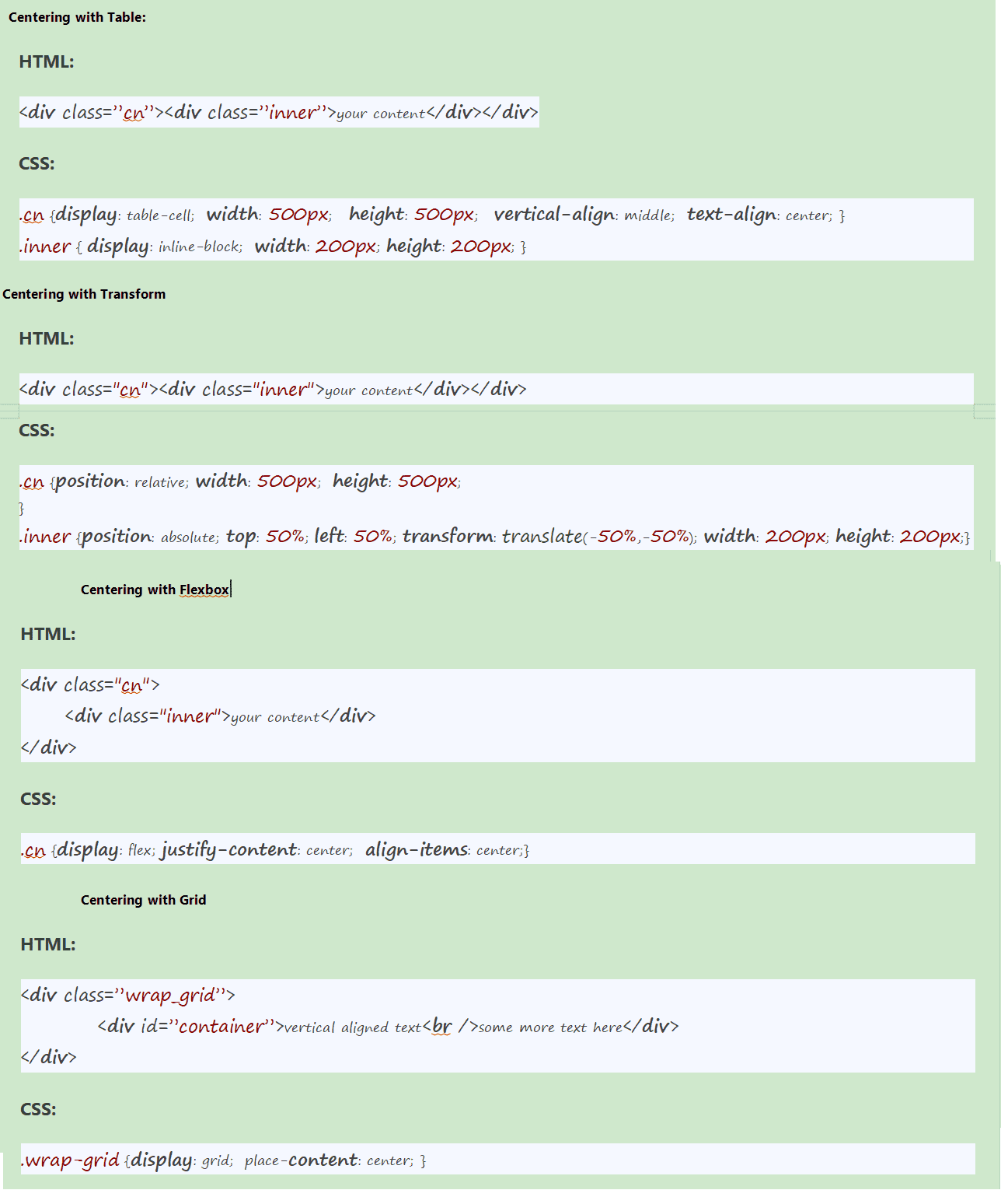
We can use the give code to put smoothness on targeted link html { scroll-behavior: smooth; }
Using display property(display: none). It’s not available for screen readers. The element will not exist in the DOM if display: none is used.
Using visibility property(visibility: hidden), will take up the space of the element. It will be available to screen reader users. The element will actually be present in the DOM, but not shown on the screen.
Using position property (position: absolute). Make it available outside the screen.
The keyword initial can be used to reset or restore its default value. We know that every property has its default value like paragraph has default color “black” which will appear on the browser when we don’t reset/give any color to paragraph tag.
Similarly the default font-size of any paragraph is 16px which will apply if we don’t give any font-size. So, if we want to know the default value of any property then we can use initial. For example p{color:initial}, it will set black color in the paragraph because initial return the default value. Similarly, p{color:inherit} will give the color given in parent of paragraph tag if any else return the default one.
Unset:- Unset will return initial value if nothing has been set in the parent div else inherit.
Agar parent mei kuch set hai to parent ka value yani inherit lega (display mein nahi lega kyonki
display inheritance property nahi hai) aur agan parent mein kuchh set nahi hai to initial yani CSS ka
default value lega.
Revert- will take the browser's default value; div{display: revert;} will return block(in 2 lines for
2 divs but div{display:initial} will return inline(in one line for 2 divs) because initial takes the
CSS default value.
Difference between Unset and Revert:-
Unset will return initial value whereas Revert will return the user aget stylesheet default value(also
called browsers style sheet value or value set by different browsers for different properties).
More images available in pdfnotes
Refer audio for more clarification
Way to create seach filter
- Take onkeyup event in the input field. Like onkeyup = 'searchFun()' and also one id like id="myInput"
- Define the searchFun() before the end body closing tag within
- Third step to target input area value and then chaged to toUpperCase.
<script> const searchFun = () => { let filter = document.getElementById('myInput').value.toUpperCase(); } </script>
Whenever we make any website, we need to check whether that website is working fine or looking fine in different screen sizes and different browsers or not and to check this, we need to do some test and that test is called cross browsers compatibility testing or browser-specific styling testing to fix the issues. We also call it CBT(Cross Browser Testing)
Web Testing Coverage(The data of all the browsers, devices, Screen-Sizes and Operating Systems on which website will be tested) We create three kinds of applications. 1.Web Application:- We will focus on Web Application and we will test it in different browsers like C hrome, Firefox, IE etc. and laptops of different companies of different screen-sizes. So, we need to check/test our web in these different platforms to ensure my web will work and look fine. 2.IOS Application 3.Android Application We can write browser-specific styles separately in different sheets and load that only when the specific browser is used. This makes use of the server-side rendering technique. In another word, write CSS for different browsers like Chrome, IE and load IE style when user is viewing the website on IE or Chrome style when viewing in Chrome and so on. We can use auto-prefix for automatically adding vendor prefixes in the code. We can also use normalize.css or reset CSS techniques.
There are some ways for avoiding browser compatibility issues too. They are as follows:
- DOCTYPE ERROR
- Browser Detection:-
- Validation of HTML and CSS code:
- CSS reset:-
- Layout compatibility:-
- Use friendly libraries and frameworks like bootstraps
- Separate Style Sheet for different browsers.
- Test on real devices:
It is better to use DOCTYPE because older browser versions check for DOCTYPE tag at the beginning and if not found, the application rendering won't be proper.We know that !doctype(document type) is used to tell the version of document of HTML to the browser. If we write it means that we have used html5 and the other developer will understand that in this document html5 has been used and edit accordingly. It is not case sensitive. So, can be written in small.
Browser Detection is used to get user’s data like which browser the user is using, what the version and agent of the browser are so that we do the coding accordingly. In javaScript we use code to detect the AppName(Browser’s name), AppVersion(Browser’s version) and agent using navigator.appName(to get app) navigator.aapVersion(for version) and navigator.userAgent.
We know the codes we have written in the HTML and CSS files will be used by different browsers. So, we need to validate or check these codes like if closing tags, semicolons are missing or syntax is wrong which can create problems while rendering the code. We can use tools for validate such as W3C, HTML and CSS validator or Jigsaw.
To ensure our website look alike in all the browsers used by the users. If we don’t do so, browser's default value such as line-height, color, font-size, and margins etc. will be applied and it can be different for different browsers.
We need to check this as well and better to use flex and grid for making layout to avoid layout issues.
It is good to use tools like Test sigma for this purpose that enables us to test in real devices.
We have different ways to downward the file, image etc.
We can take anchor tag and use an attribute download, we need to give the path of the file we want to downlaod under href attribute.we have to downlaod the entire files of any webpage, we should use gip file. We can simply do by compressing to zip. Just right click on the file and compress to zip
We may not able to downlaod when working with local server. It is better to use it online
Progressive rendering is a techniques used to improve the performance of a web-page so that web page can display as quickly as possible.
Rendering means converting code into an interactive web page that our users can see and utilize its
functionality.
and Progressive means doing things such that the highest priority thing will be
done first, after that less priority thing will be done and in this manner, work will be completed.
So, Progressive Rendering means rendering the web page in such a manner that high priority component
will be rendered first and then low priority component will be rendered.
So the priory of our component should depend upon the viewport. This means those components that come
in the viewport after loading the website for the first time should get high priority and those
components that are below that viewport should get low priority.
Client-Side Rendering means rendering pages directly in the browser using JavaScript.
All logic, data fetching, templating and routing are handled on the client or browser on which you are
working on rather than the server.
We have different ways to Achieve Progressive Rendering-
1. Lazy Loading of Image: Lazy loading of an image means loading an image when it is about to come in
the viewport instead of loading all the images initially at once. This will lead to the progressive
rendering of the web page because here the high-priority image is the image that is initially in the
viewport and is loaded first and the low-priority image is that which is about to come in the viewport
and will be loaded.
2. Not processing all the CSS initially: Most of the developers have a habit of adding all CSS in the
head section and because of that whole CSS will be processed first before processing of HTML. But to
achieve progressive rendering we should only add that much CSS in the head section that is necessary
for those HTML that will be in the viewport at the start. After that, Add the remaining CSS in the
body before the HTML tags to which it will be applied.
client and Server side rendering
In Client-Side Rendering the content is rendered on the client side but In Server-Side Rendering, the
content is first rendered on the server side and
then send to the client side.
For example:-
In Client-Side Rendering, when a user visits any web
page then request made by the user is sent to the server and server returns response of the request in
the form of HTML and CSS file to the client side but these html and csss will be empty or have no
content because all content is rendered by javascript.
Now, clients will start parsing html and css but there will be no content because html has no
content so we will see a blank page.
After parsing the parser will come across the JavaScript because we put the script tag before closing
tag of body. Now, parser will start
downloading the JavaScript where our content available and once the JavaScript is executed, all
necessary content is rendered and then application becomes
viewable and interactive.
Note: I would like to inform you that parsing html and css is fast but not
JavaScript and this is why a blank page will be rendered to the user until the JavaScript is executed
because the HTML has no content so the user will have to wait JavaScript to be loaded and executed.
This is the reason that Client-Side Rendering is slower than the Server-Side Rendering.
In server side rendering, first loads the HTML and CSS file on itself and then processes it and then
sends the processed web page to the client side. After getting that webpage, the User can see the
webpage and the browser will be waiting for the JS file to be loaded. Till the JS file is not loaded,
the User can only see the webpage but can’t interact with it. Interaction with the web page is only
possible with the help of JS(Javascript).
Progressive Rendering Explaination
In progressive Rendering, the web page is divided into different parts on the basis of priority. So different parts will be rendered according to Server-Side Rendering and sent to the client side. This means that here first whole page will not be rendered on the server instead, high priority part of the page is rendered and sent to the client side, then low priority part of the page is rendered and sent to the client side.Benefits of Progressive Rendering: These are some of the major benefits of Progressive Rendering- It improves the load time of the website and that eventually leads to a better User Experience. It optimizes the critical rendering path. Critical rendering path is referred to those steps that are done between receiving HTML, CSS, and JavaScript code and converting them into a visual web page. It helps us to overcome the drawback of server-side rendering and client-side rendering.
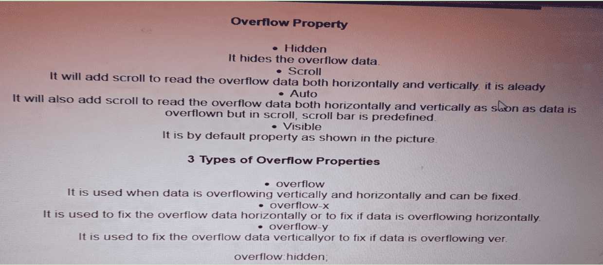
There are three properties of counter and they are actually three phases to run the counter.
First one is, Counter reset: my-counter 1; here we give one name and also define the initial or starting point from where we have to start the counter.
Second is Counter() function that will run the counter (my-counter from 1) but for this we will use Content: counter(my-counter ); // It will print the counter and to increment from 1 to 2 we will use
third property Counter-increment: my-counter 5; // Here we define that my-counter needs to increment by 5, you can given 2,3 etc. So, it will print 1, 6 , 11 etc.
Refter notes for more details
Animation means moving the element or any div. It does not require hover.
The first property of animation is animation-name , we need to give a name to the
animation
to use it and it can be anything.
animation-duration It is used to determine how long you want to run the animation.
animation-direction
1. Noraml:- It is a default value. if from is 0% and end is 100% then normal will follow the same. start from 0 and end at 100% then restart from 0 and end at 100% and so on.2. Reverse:- It will start from where it ends like from 100% and end at 0% and so on,just opposite of normal.
3. Alternate:- It will restart the animation from where it stops. Like starts from 0 and end at 100% then it will restart from 100% to 0% and so on.
4. Alternat-Reverse:- Just opposite to the alternate. Like starts from 100% and end at 0 then it will restart from 0 to 100% and so on.
animation-timing-function values
1. Ease:- It starts & ends slow but fast in the middle.2. Linear:-Same speed from start to end.
3. Easy-in:- It starts slow but fast in the middle and end.
4. Easy-out:- It ends slow but fast in the middle and start.
5. Easy-in-out:- Starting and ending slow but fast in middle.
6. Steps:- It will move in 4 steps.
animation-delay After how long you want to start or end the animation.
animation-iteration-count How many times you want to run the animation
animation-direction How you want to animation like reverse etc. There are four values
of animation-direction as mentioned in the picture.
animation-fill-mode
animation-play-state
animation It is a short hand of all the abover properties.
Two ways to write keyframes
Every animation starts from 0% and end at 100% which can be changed and we can also give differnt css properties at 0%, 10%, 30% etc. One animation will complete when it reaches 100%.
@keyframes animation-name{from{css properties} to{css properties} } We need to take a
selector to
use animation
called @keyframes. We need to take two key words within the keyframes
from{css properties} The place from where we have to strat css and
to{css property}The place from where we have to end css.
ANIMATION WITH FILL-MODE
fill-mode is used to give differnt conditions on differnt percentage or stage of start to end. Like if we want that when animation reaches at 20% the color of the div is blue, when it reaches at 50%, the color of the div should be red and at 100% black then we will use animation-fill-mode.Its first value is none means default and it will bring no change. backward means start the animation till the time delay is not over which means if we set delay for 5s the default or the original background which is here yellow will display for 5 second and then animation will start.
ANIMATION WITH FILL-MODE WITH BACKWARD VALUE
backwards means showing the initial stage like the resule when element is at 0% means the width & height you have set for the div. In the given picture, background: yellow; is at 0%
ANIMATION WITH FILL-MODE WITH FORWARD VALUE
In forwards, the animation will stop at 100% and the color will display as it is set so it will not come to the initial stage. Yeh, 100% mein jo set hoga usse dikhayega like width is 300px background is black and initial state nahi dikhega.
How to use AOS
CDN SOURCES TO USE TO APPLY IT
css link at the top of the head tag
use this link with link tag and rel="stylesheet"js link at the bottom before the end of the body tag
use this link with script tag with attribute src=""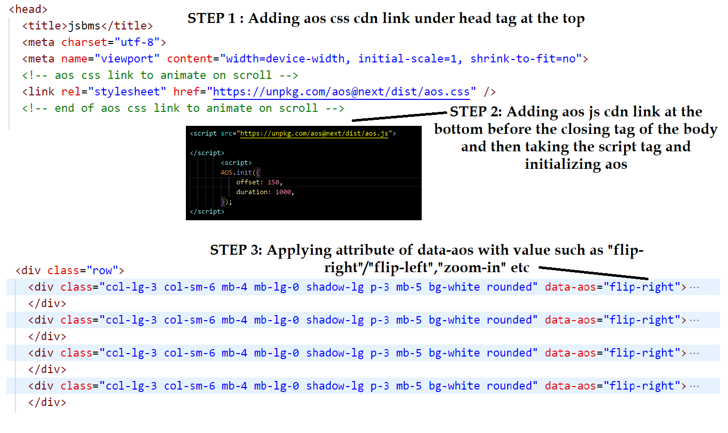
Link to see how it works and data-aos value that will decide how to animate
Click on itaos documentation
How to stop animation on hover and click?
We can use a property of animation called animation-play-state: paused to stop and animation-play-state: running; to keep running in css
https://www.youtube.com/watch?v=fwYEzMfBFUo
In javaScript, we can use clearInterval(timer); where timer= setInterval(autoPlay,4000)
TRANSITION
It is used to give smoothness when you hover, without it if we apply, it will jerk. transition:width, height, background 2s, 2s, 2s; is shorthand of transition-property. transition:all 2s: all will apply for width, height etc. and 2s if all the duration is same. transition-delay means after how long hover should start or end.
TRANSFORM 2D
It is used to rotate the div or any image. transform: rotate(30deg);will rotate 30degree. degree can be written in minus as well. transform: (30deg);
TRANSFORM 3D
If the width and height of two divs are same if we use transform: rotateX(60deg); in the child div then then child div will act like a curtain closing horizontally. perspective gives a 3d look and also show how it is moving. the more is the perspective(800px) the better 3d will look as when we sit in the cinema hall and watch from the balcony, it gives clearer than sitting at front. perspective is used in 3d only. perspective(800px). perspective-origin has defaulf value (center center) horizontally & vertically.
perspective
Perspective is applied in parent div. perspective-origin:left/right/top/ bottom/left bottom/bottom right/ top right/20% 35%
With skewX
It will rotate the div from x asix(horizontally) which means left bottom border and rotate with the angle you set as given below:-transform-origin
Earlier the point of the div was center from where the div was being moved. Now, we can change the origin like green color in the picture is the left-bottom(x asix(horizontal) se left and y axis(vertical) se bottom)and yellow is right top. It can be given in % as well like transform-origin:100% 20%;
transform:translate()
It is used to move the div horizontally and vertically but the text inside it will not move. I will move 100px horizontally to the right and it can be written as transform: translateX(100px 45px); the value can be given in minus to move left and up
transform:scale()
It is used to increase the width and height of the div. transform:scale(2) means double the size horizontally and vertically but transform:scaleX(2) means double the size horizontally and transform:scaleY(2) means double the size vertically.
transition n transform
We will write #ex1:hover{transform: rotate(360deg); under style and transition:transform 1s; so that when we hover ex1 div, it will rotate 360 degree within 1 second.
BACKFACE
It needs to be applied in parent div and also it will work with transform: rotateY(30deg); or rotateX() for horizontally. It helps to show the back of any image/div when we rotate any div by 180deg in 3D/2D. We will be able to the back when we rotate any div by 180deg. In the given example if we set backface-visibility:hidden; the backface does not appear when we hover but when backface-visibility:visible; the backface appears as you can see.To support the transition to all the browsers
{ transition: background 0.20s linear 0s; -o-transition: background 0.20s linear 0s; -ms-transition: background 0.20s linear 0s; -moz-transition: background 0.20s linear 0s; -webkit-transition: background 0.20s linear 0s }
Way to create form to store in the database

CSS sprites are used for combining multiple small images in a single larger image and then use that single larger image into multiple small images in CSS.
For example, if I have three different flags for different country. I will combine them and make a larger image and at the time of using that larger image in CSS we will use the three flags separately whenever I need whichever country flag.
In the development of the project, we may need several small icons, social media icons or small images and the more images we use will go to the server more times. So, we will combine the all small images in one so that it reduces the number of HTTP requests to get data of multiple images. Now, we will send only one single request.
The limitation of image sprites is that it can be used as a background image only not work in direct
image.
It reduces the number of HTTP requests to get data of multiple images as they are acquired only by
sending a single request.
It helps in downloading assets in advance that help display icons or images upon hover or other
pseudo-states.
How to see the code of code-lab
- Visit the site
- Click on the image you want to see the code
- Go to Restul tab
- Not, enter Cntrol+U to see the code
- Search for result which should be under h3 tag and then click on result.html just below the h3 tag under iframe tag
- Now copy the code in your own index.html and also copy and paste css and js by clicking on css and js
How to add new content in code lab
- Login to hostinger>codelab>index.html
- Go to under the class of gallery-items
- copy and paste
- Go to formate and change the file of hover10 to any name and inside the hover10 go to css >> load css and then and under style paste the css code
- To add the js code, go to js file and paste under scriptLoad
- Put your html code under htmlInCode.html
- Under result.html, put your all html code with style and script link and paste it as done in header_responsive
How to create equal height column
To create equal columns, we will take a container and inside it all the divs that we you want make of equal heights no matter how much contens are there in one and nothing in another. Apply display:table; in the main container, and in all the divs apply display:table-cell, To keep the divs items on the top/center/vertically, we will use table-align:top/middle/bottom in the main container. and to give space/margin, we will apply border-spacing:5px in the main container.Note:- Many things can be learnt about the coding of css and js in "How to" section in w3schools. To create equal columns using, disply flex, we can go to FET>>CSS>>equal column
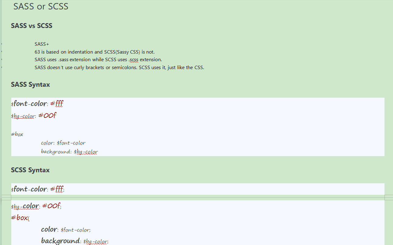
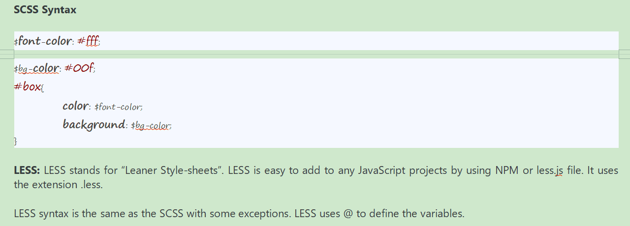
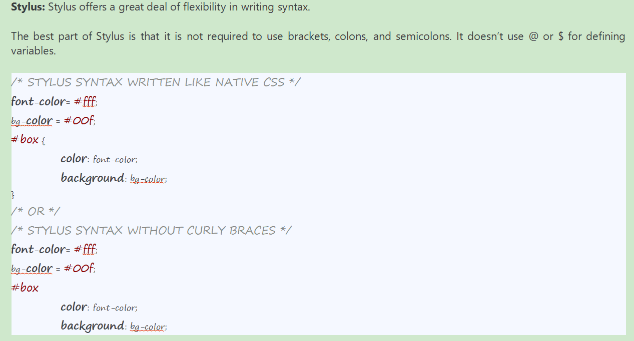
A CSS Preprocessor is a tool that allows to do almost everything that we can do in JavaScript and other programming language. Like – variables, functions, mixins , for loop, nesting, and some extend of inheritance.
Some of the preprocessors are SASS, LESS AND STYLUS. SASS: Sass is the acronym (संक्षिप्त रूप) A·kruh·nuhm for “Syntactically /sɪnˈtæk.tɪ.kəl.i/ Awesome Style Sheets”. There are two ways to write SASS syntax. SASS or SCSS
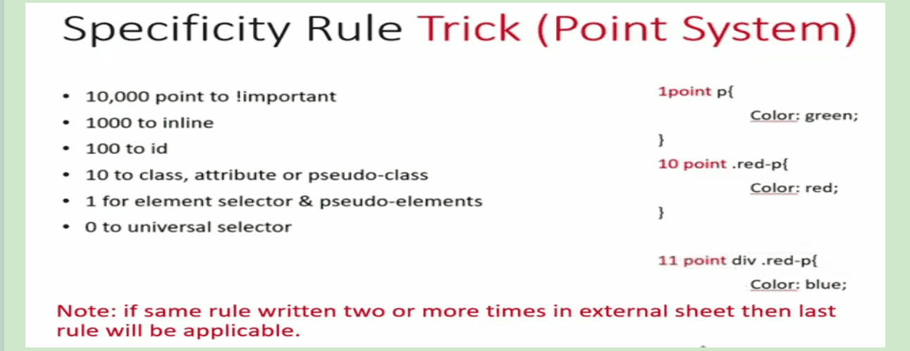
Specificity is a rule that tell which style will be applicable if one element is styled by more than one rules. More specific rule(more detailed information) will get more value but if inline style is applied then inline style will be applied and if !important is applied then it will be applied.
We should not inject. HTML does not throw any error. However, framworks may break during the production and it is also not correct symatically becuase google may give low score and have ranking issues.
HTML
CSS

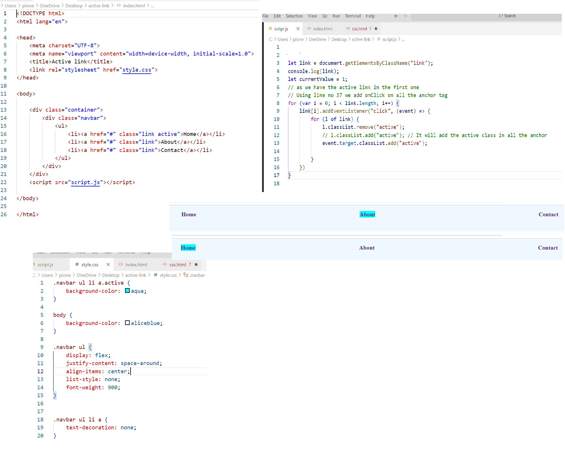
Path of the file to see the demo
fed>>css>>active linkHow to use google meet
- Visit the given link
- Login with you gmail account
- A simple success list group item
- A simple danger list group item
- A simple warning list group item
- A simple info list group item
- A simple light list group item
- A simple dark list group item
